


“There’s an app for that.” It’s been more than a decade since Apple trademarked the catchy slogan that signaled the arrival of the age of the app. These days, mobile apps are no longer novel. But they are every bit as ubiquitous. In fact, they form the foundation of how most users engage with their mobile devices. Yet for many organizations, healthcare app development is still on the bleeding edge of the healthcare digital experience.
That lag has less to do with the healthcare industry’s understanding of consumer needs and more to do with the complicated nature of healthcare services — and the digital experiences that support them. Member portals typically contain a plethora of sensitive information and complex functionalities. And many of them haven’t always translated well to a mobile context. On top of that, healthcare organizations often assume their mobile app should include all the same features and functionalities as the desktop version.
Here’s the reality: In today’s digital-first world, your customers assume “there’s an app for that” when it comes to managing their health insurance policy and claims details. And they expect it to serve up the same intuitive user experience they get from their banking, shopping, and entertainment apps.
The way to achieve that isn’t by chasing feature parity. Rather, the secret to designing a successful mobile digital experience is subtraction. Your goal? Include only the features and functionalities your users really need when they’re on the go. Then translate those priorities into a digital experience that plays to the unique strengths of mobile operating systems.
To see what this process looks like in action, consider our recent engagement with Healthcare Management Administrators (HMA), a leading third party benefits administrator for self-funded health plans.
From Feature Parity to Feature Popularity: Zeroing in on the Features that Matter Most to mHealth App Users
When we first partnered with HMA to rebuild the web and mobile versions of their member portal, their stated goal was to have feature parity between the two apps. But as we moved through our discovery and design process, we made the case for a completely unique mobile app that would come with its own bespoke set of features and functionalities.
A Research-Driven Approach
The data shows that consumers approach mobile digital healthcare experiences with an entirely different mindset and set of priorities — which are primarily defined by the on-the-go context in which users access them.
We knew HMA’s customers would almost certainly prioritize certain tasks and features differently in a mobile versus desktop experience. But we didn’t make any assumptions. Instead, we started with UX research.
This included:
- Lean user research. We leveraged a variety of lean UX research tactics, including gathering insights from HMA’s customer care team, gleaning findings from previous user testing on HMA’s web portal, and leveraging qualitative research from Gartner and other third-party industry experts. Together, these activities gave us rapid insight into HMA’s customers and industry best practices.
- Interviewing product owners and key stakeholders. Internal stakeholder interviews afforded us an up-close-and-personal understanding of HMA’s internal processes, user needs, and business goals.
Collaborative Solutions and Native Features
Once our initial research was complete, we met with the HMA project team to ask questions that arose from our research, present a range of options, and align on a solution.
As we honed in on a set of features, we leveraged our deep UX experience in the healthcare digital space to sort the wheat from the chaff. Our goal? Strip away unnecessary features — as well as any assumptions, inertia, and stereotypes about how an mHealth app should look and act.
Another key goal in our design process was to leverage the native features that are part and parcel of the iOS and Android mobile OS, such as the camera, geolocation, and face ID capabilities. Doing so doesn’t just afford a more seamless user experience — it can actually reduce development costs, too.
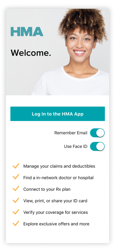
HMA’s mHealth App: Targeted Functionality and Native Features Equal Superior UX
By the time we were done, HMA’s mHealth app boasted a lean, focused feature set that made smart use of native capabilities.
Key features include:
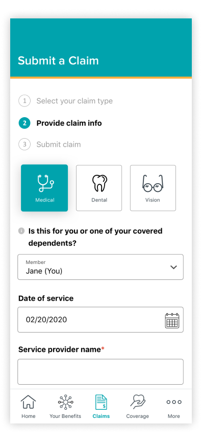
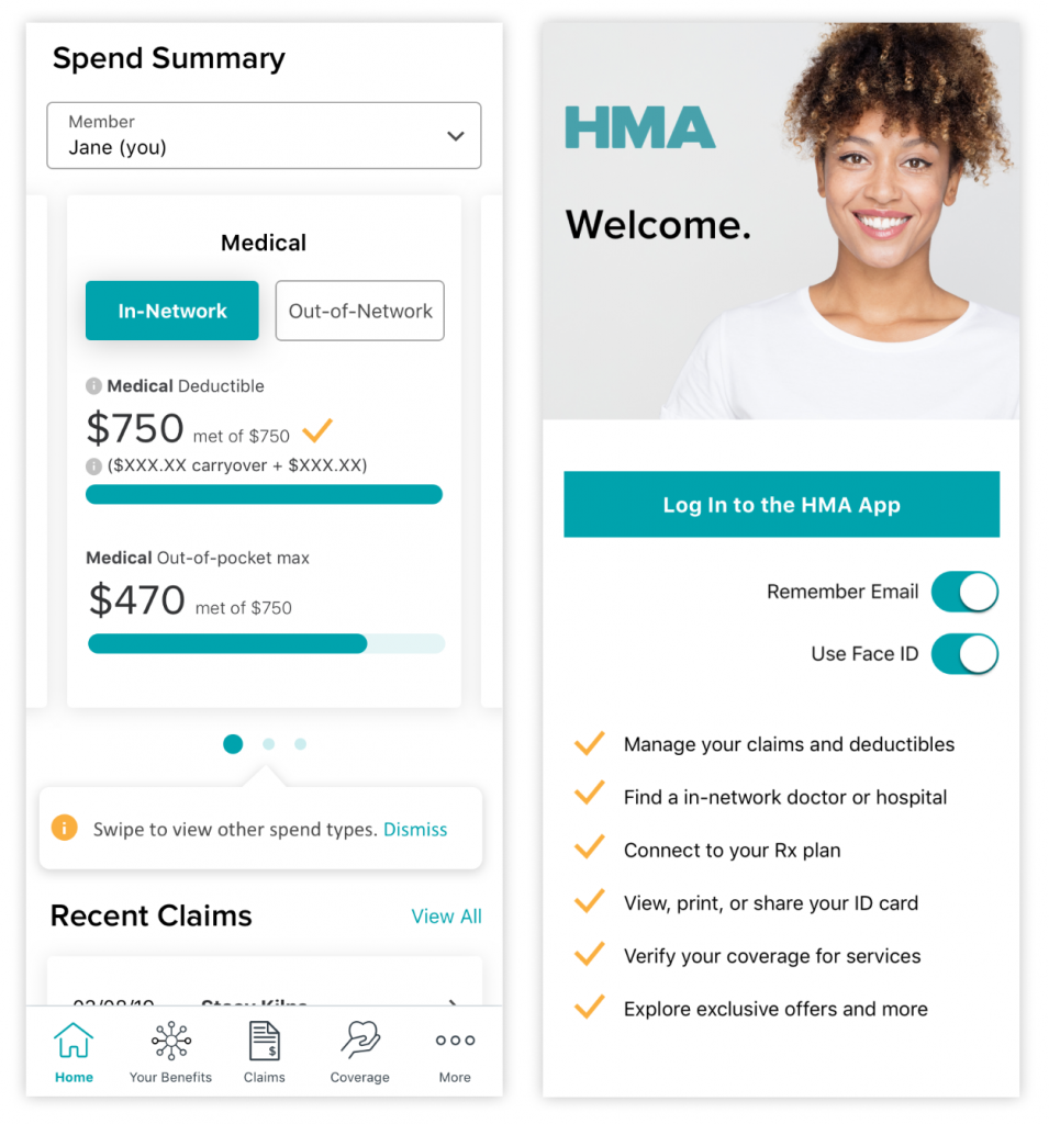
- Displaying member ID cards front and center, making it easy for users to instantly access this critical and high-demand information. (Many users access the app on their way to a doctor’s appointment.) Additionally, we incorporated interactive behaviors that made the ID card “flip”front to back for a more 3D experience.
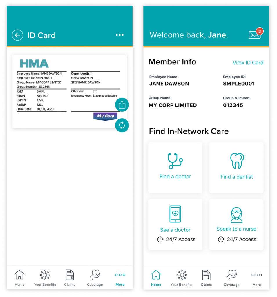
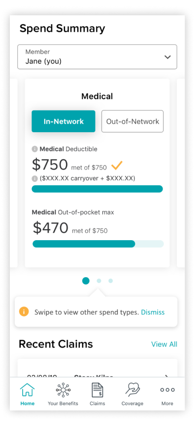
- A simplified member data presentation with progressive disclosure — showing just enough recent data for context and allowing users to view more if desired.
- Native UI design best practices, including the standard app bar, swipe interactivity, and tabbed content, allowing users to access the most important information with as few interactions as possible.
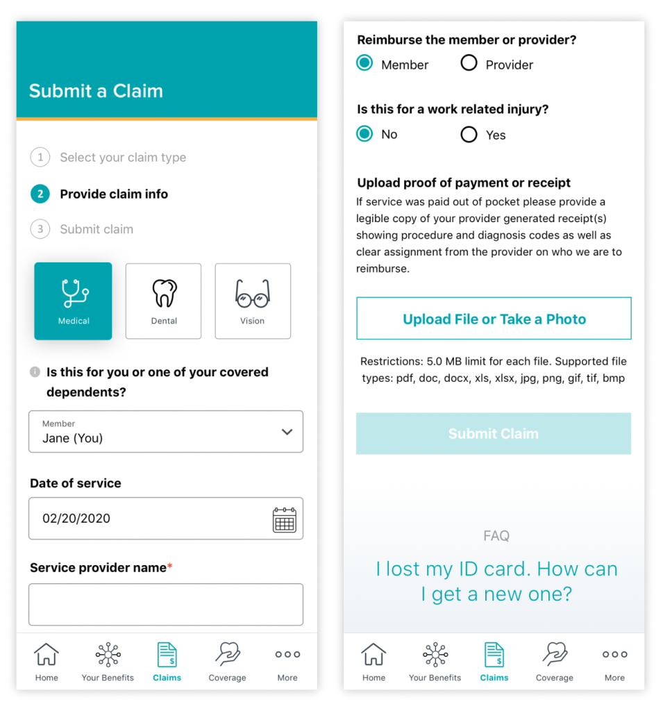
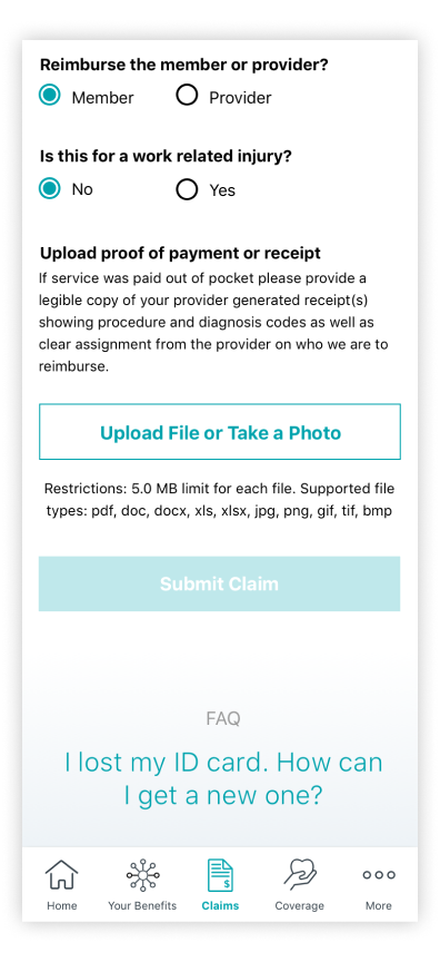
- A streamlined claim submission process that leverages the device’s native camera to photograph a bill and upload a claim.
- Login using FaceID. Knowing that mHealth apps represent a heightened security risk given the sensitive personal data they contain, we implemented tighter security practices. Users are automatically logged out after a relative short period of inactivity. However, to compensate for what might be an unpleasant user experience, we implemented a mechanism to quickly log into the app using FaceID.
- Rapid messaging. To ensure quicker resolution of issues, we included a push notification mechanism that pings members as soon as they receive a reply from HMA’s customer support team.
Are you ready to take your healthcare organization’s mobile digital experience to the next level? UpTop Health can help.