


Most people think of user experience (UX) in terms of a digital experience’s final design — how a website or app looks, feels, and behaves. But great UX always begins with research. By honing in on what matters most to users, thoughtfully crafted user research sets the direction for the design work that follows.
The thing is, while most healthcare companies recognize the importance of user research, many of those same companies also struggle to actually embrace it. They may have the perception that UX research in healthcare is a long slog of costly activities that eventually get filed away. When it comes to long-established healthcare companies that “already know our users,” the temptation to skip (or skimp on) user research can be strong.
But the ROI on UX research is a no-brainer. And that’s especially true if you partner with an agency that embraces lean UX research methods. In a lean framework, user research doesn’t have to be cumbersome or costly. To the contrary, lean UX research means strategically targeting the highest-value activities that will yield the most valuable and actionable insights. By cherry-picking the most impactful research methods, you can move efficiently into the design phase with a boatload of beneficial insights to guide you.
What is Lean UX Research?
Lean UX research is an agile approach that seeks to maximize both the efficiency and value of the user research phase. All UX researchers have an expansive toolkit of approaches and research methodologies to choose from. Some UX firms utilize a long list of comprehensive research activities for every project they touch. By contrast, lean UX researchers focus on selecting only those activities with the highest value given the primary problems an organization is currently trying to solve. In addition, lean UX attempts to carve out the most economical processes for each methodology to arrive at reliable, actionable insights.
For example, at UpTop Health, we utilize something we call R.I.T.E. testing. R.I.T.E. stands for “rapid iterative testing and evaluation.” An accepted industry rule of thumb in UX research is that you can catch the majority of usability problems with as few as five test users. In standard user testing sessions, researchers will test the same design on all five users to get a baseline. Only then do they go back and start implementing changes based on their findings.
With R.I.T.E., we take a much more streamlined approach by iterating on the design in real-time, as each user offers their feedback. We act on findings from each user’s session depending on how insightful it is. For example, if a user’s session reveals a broken function, we’ll fix it before presenting the design to the next user. If their feedback seems more subjective (to the extent that we aren’t sure how other users will react), we wait to see how other users respond before making a decision. This iterative process is repeated after each user’s test session. By the time we get to the final participant, we already have a highly optimized design relative to what we started with.
Lean UX in Action: Learning from Real-Life Success Stories
The following real-world examples (both within and beyond healthcare) demonstrate how we use lean UX research to make a material impact on our client’s projects.
HMA’s Member Portal: Prototype and Usability Testing
Challenge
HMA is a pioneer in self-funded health benefit programs and one of the nation’s largest third-party administrators. As with most payers, HMA’s member portal is the main destination for members to find in-network providers, view and submit claims, learn about coverage, explore benefits, and manage accounts. Unfortunately, because HMA was constrained by a number of legacy systems and third-party services, their existing member portal suffered from a suboptimal user experience. They asked UpTop Health to reimagine their member portal from the ground up with user experience and accessibility top of mind.
Solution
Because the changes to HMA’s new portal were so significant, we knew we needed to gather feedback from actual users and validate our new designs. We needed to confirm that the new designs actually supported members in completing the core tasks available on the portal.
To that end, we built an interactive prototype and leveraged usability testing — specifically R.I.T.E. testing — on a group of prospective customers with past experience managing healthcare plans online. We iterated from one participant to the next, gathering insights as we went along.
For example, in the existing member portal, claim information was initially presented as a summary. In order to see the details, users had to click a second tab to reveal the next layer of information. In our testing, we found that 80% of participants experienced difficulty accessing those details. This was a critical finding that alerted us to make a major design change.
Outcome
In redesigning HMA’s member portal, we integrated UX best practices from within the healthcare industry and beyond. By providing a window into how HMA’s actual users would interact with their member portal experience, we hammered out the design kinks early on and laid the groundwork for a more empathetic UX design. In addition, this approach saved HMA critical development time and resources by validating the effectiveness of the design before reaching development which typically costs 1000x more to fix at this late stage.
F5’s Website Navigation: Card Sort and Tree Test
Challenge
F5 is a leading application services and delivery networking company. With a wide array of solutions and products, F5 needed a solid navigation structure to aid customers in finding the right solutions. Unfortunately, their existing navigation wasn’t quite up to the task. Their navigation was originally designed by internal stakeholders. Without even realizing it, they viewed the navigation through the lens of their own internal organizational structure rather than the customer’s mental models. They asked us to redesign their navigation so that it supported customers in finding the right products and solutions.
Solution
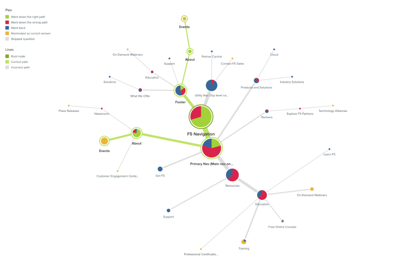
Leveraging existing customer personas, UpTop recommended a remote card-sorting exercise spanning the persona types. Approximately 30 participants completed the exercise, providing a valuable view into their perceived mental models of the navigation items. These insights included their familiarity with the navigation’s taxonomy. After analyzing the results, we re-architected the navigation.
From here, we performed another research activity called a tree test. In this assessment, participants are presented with a basic folder structure and asked to complete a series of common user tasks. Approximately 50 participants completed the exercise, which allowed us to further optimize the navigation’s design.
Outcome
Getting the navigation right for F5 was paramount to the company’s success. Prospective customers need to be able to find exactly what they’re looking for — or it could be a missed business opportunity.
Our tree tests revealed that 55% of users’ navigational decisions were chosen without backtracking. This indicates that participants were able to find what they were looking for with folders alone (and no additional user interface to guide them). This was a good start, keeping in mind that additional design recommendations and an actual user interface would only simplify user’s wayfinding and help to drive this percentage way up.
Mattress Firm’s Mattress Matcher: Field Research and Mystery Shopping
Challenge
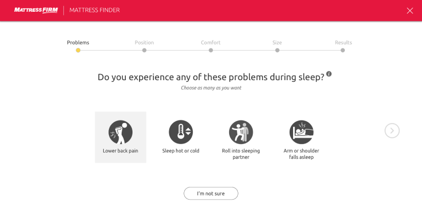
The number one problem customers on the Mattress Firm website have is finding the right mattress. To that end, Mattress Firm came to us with the goal of creating an automated mattress-finding wizard dubbed the Mattress Matcher. This quiz-based feature would allow users to self-select preferences from a variety of options and narrow down the recommended results based on their inputs.
Solution
We used two primary research methods — field research and mystery shopping — to inform the mattress-finding wizard’s design. The first thing we did was head down to the nearby Mattress Firm store to document the mattress-buying experience. Our designer posed as a potential customer and asked the sales rep common questions about how to select the right mattress. Doing so gave us a better understanding of all the variables and decision points that were a standard part of the process.
We then performed a mystery shopping exercise using Mattress Firm’s online chat with the same goal in mind. We documented both experiences, which enabled us to compare and contrast Mattress Firm’s brick-and-mortar versus online shopping experiences. These findings laid the groundwork for our approach in designing the basis for Mattress Firm’s new mattress-finding wizard.
Outcome
The Mattress Matcher plays a major role in driving new sales conversions by increasing customers’ confidence in their mattress selection. Mattress Firm’s data shows that customers who use the wizard tool convert two times as often as customers who bypass it. In addition, Tulo (Mattress Firm’s new “bed in a box” offering) produced $100 million in its first year — with the mattress wizard tool playing a key role in those sales.
JAMS’ Case Management Portal: Personas and Journey Mapping
Challenge
JAMS is a leading alternative dispute-resolution company whose users include judges, attorneys, and case managers. Historically, these groups have relied on a disparate set of third-party tools to manage their dispute resolution workflow. They asked UpTop to design their own centralized platform that would bring those capabilities into a single repository with the ability to interface with critical external systems.
Solution
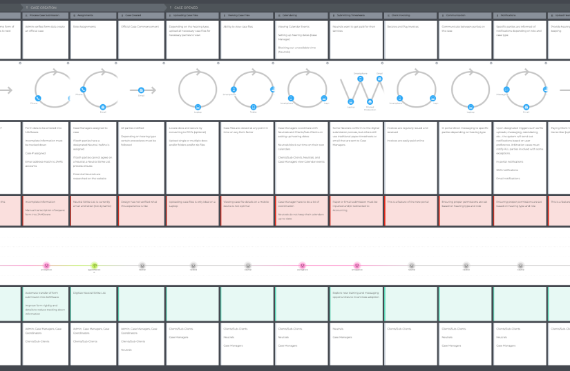
To better understand the complex workflows of JAMS users, we conducted a series of user interviews. From there, we created a set of detailed personas. Using these insights, we were able to plot out a holistic journey map of users’ workflows from a case’s inception to its closing, including all the actions and touch points in between.
Outcome
Without the persona and customer journey-mapping work, we wouldn’t have been able to visualize the complexities of the case process and every user’s role. In addition, the journey map artifact allowed cross-functional teams to better align around the goals and challenges we were solving for. Finally, our journey map clearly highlighted the friction points within this intricate process.
Want to learn more about how UpTop Health can apply lean UX research methods to reveal actionable insights on your next project? We’d love to talk.